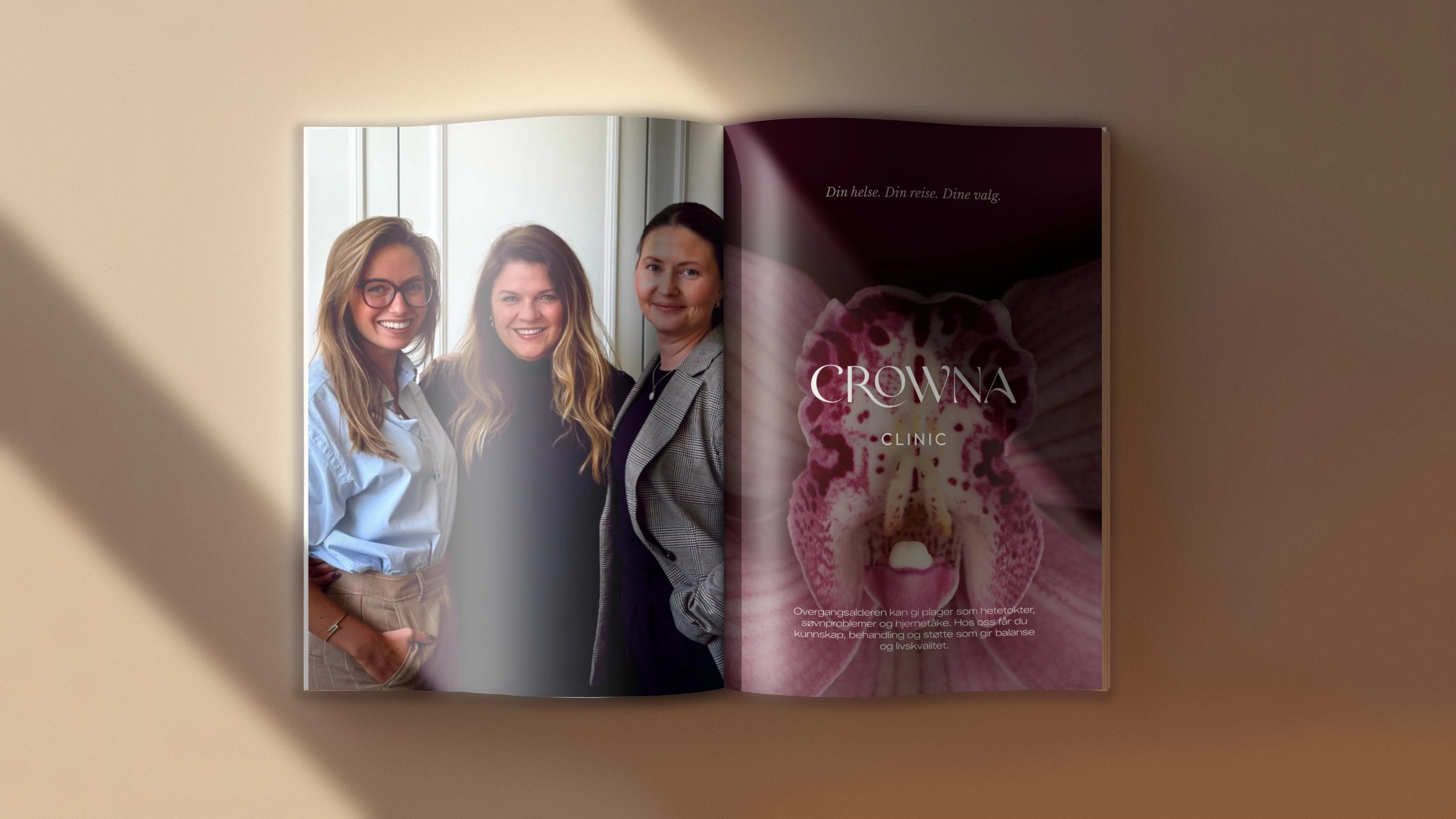
Crowna Clinic
// BRAND POSITIONING //
// visual identity //
// digital design //
// oslo - 2026 //
For CROWNA Clinic, the branding process began with the belief that a meaningful identity is shaped before the visual work starts. We placed strong emphasis on strategic exploration and a deep understanding of stakeholders and audience: what women were missing in menopause care, how they wanted to feel in a clinical environment, and which emotional, medical and cultural expectations the brand needed to respond to. From this foundation, we defined the brand’s role, tone and symbolic territory before moving into visual direction.
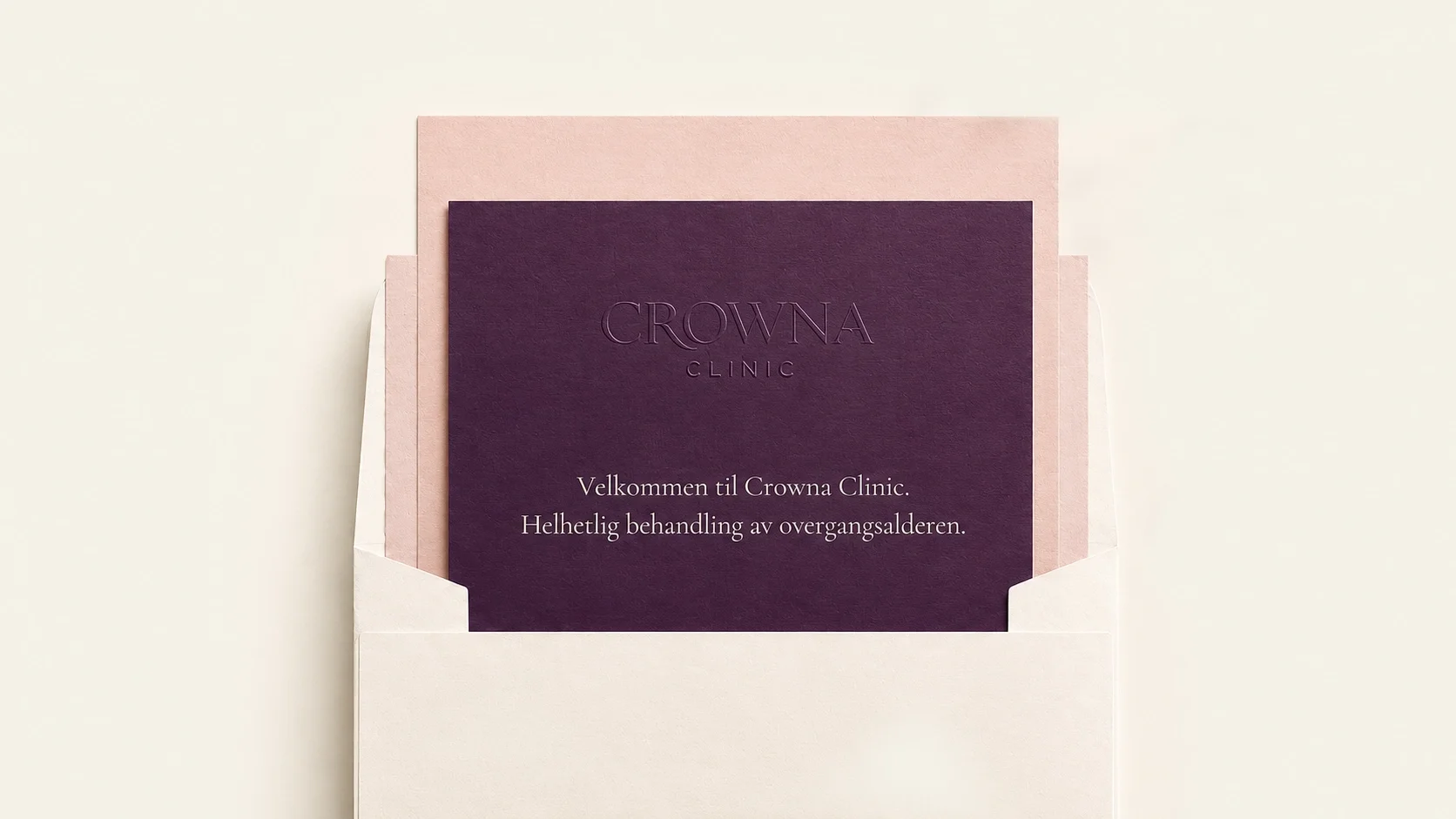
From this positioning, the identity needed to do more than look refined. It had to make medical care feel warmer, more personal and more culturally relevant.

Sharp terminals bring a sense of accuracy and control, quietly connecting the design to medicine.
The type is redrawn to feel more ownable, more precise, and more human.
The extended R reaches into the O, creating a gesture of care. It gives the mark warmth without softness, presence without distance.
The contrast does the balancing act: clinical precision on one side, emotional intelligence on the other.
The custom arch in the A becomes the final signature. A small intervention with a big role: distinctive, feminine, and unmistakably Crowna.
A Sculptural Wordmark
The CROWNA logotype uses a refined serif structure to express authority with softness. Its curves create movement, while its contrast brings elegance and presence.
The Custom R
The “R” became one of the most expressive details of the identity. Its curved gesture adds fluidity and humanity, turning the wordmark into something alive rather than static.
Crowna Clinic was created to open a new chapter in women’s health: a clinic fully dedicated to menopause, combining medical rigor, integrative care and emotional intelligence.
The visual identity translates this positioning through a sculptural serif logotype, a refined color system and a sensorial brand atmosphere. The custom curves of the wordmark, especially the expressive “R”, introduce movement, maturity and feminine presence, while the palette balances deep clinical credibility with soft warmth. The result is a brand system that feels elegant without distance, medical without coldness, and feminine without cliché.
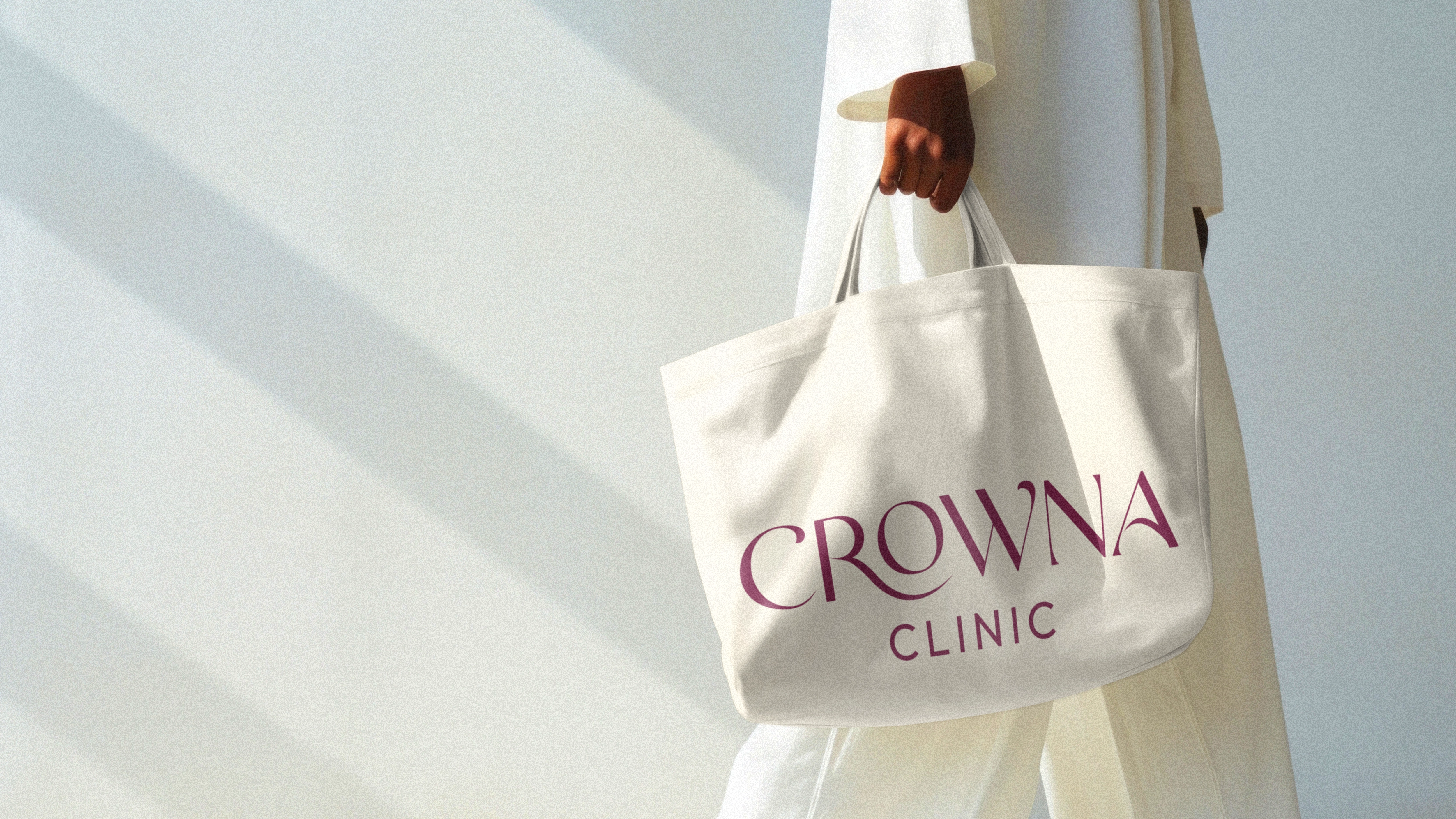
Short supporting text. Two or three lines, never long paragraphs.
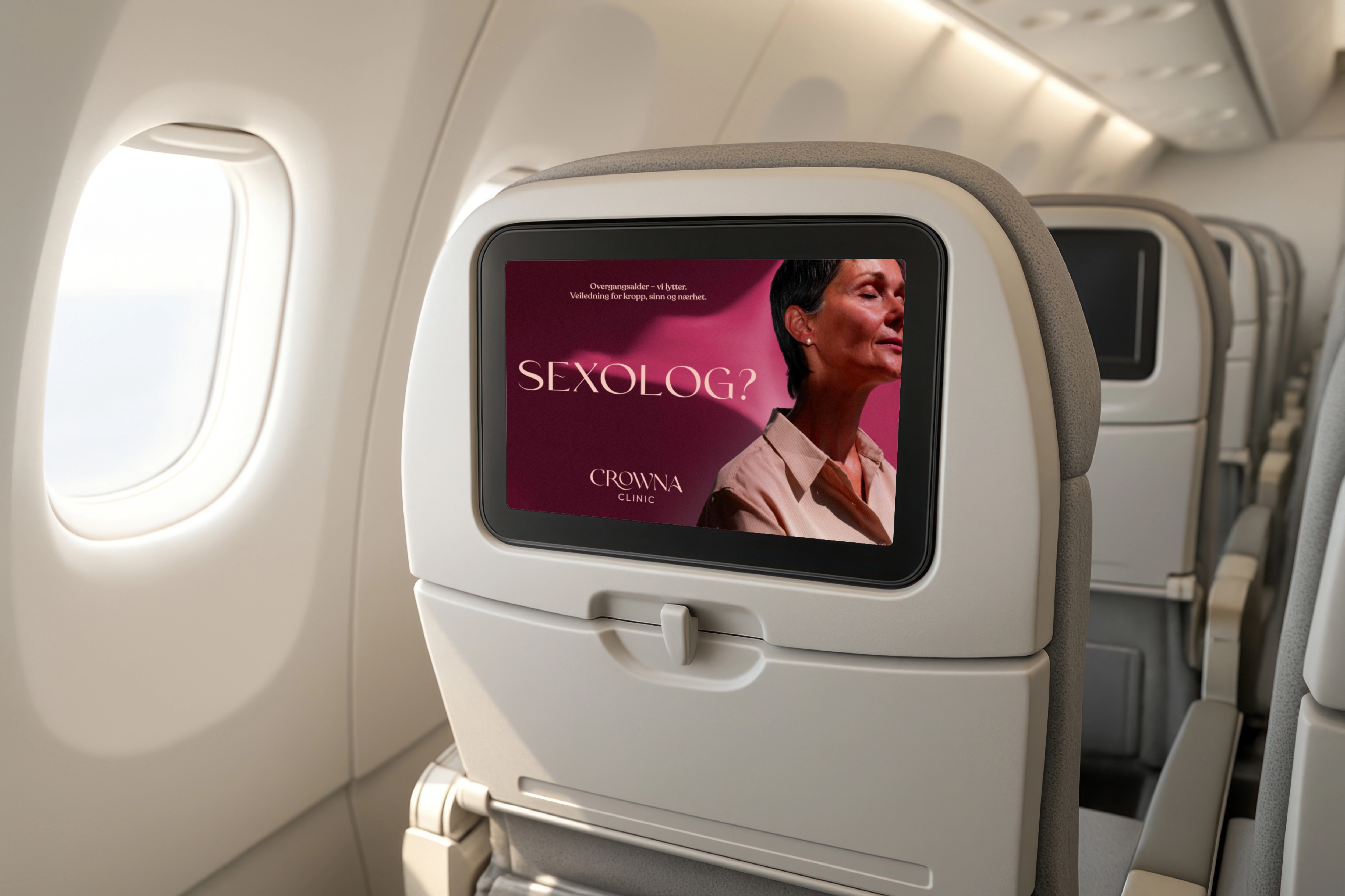
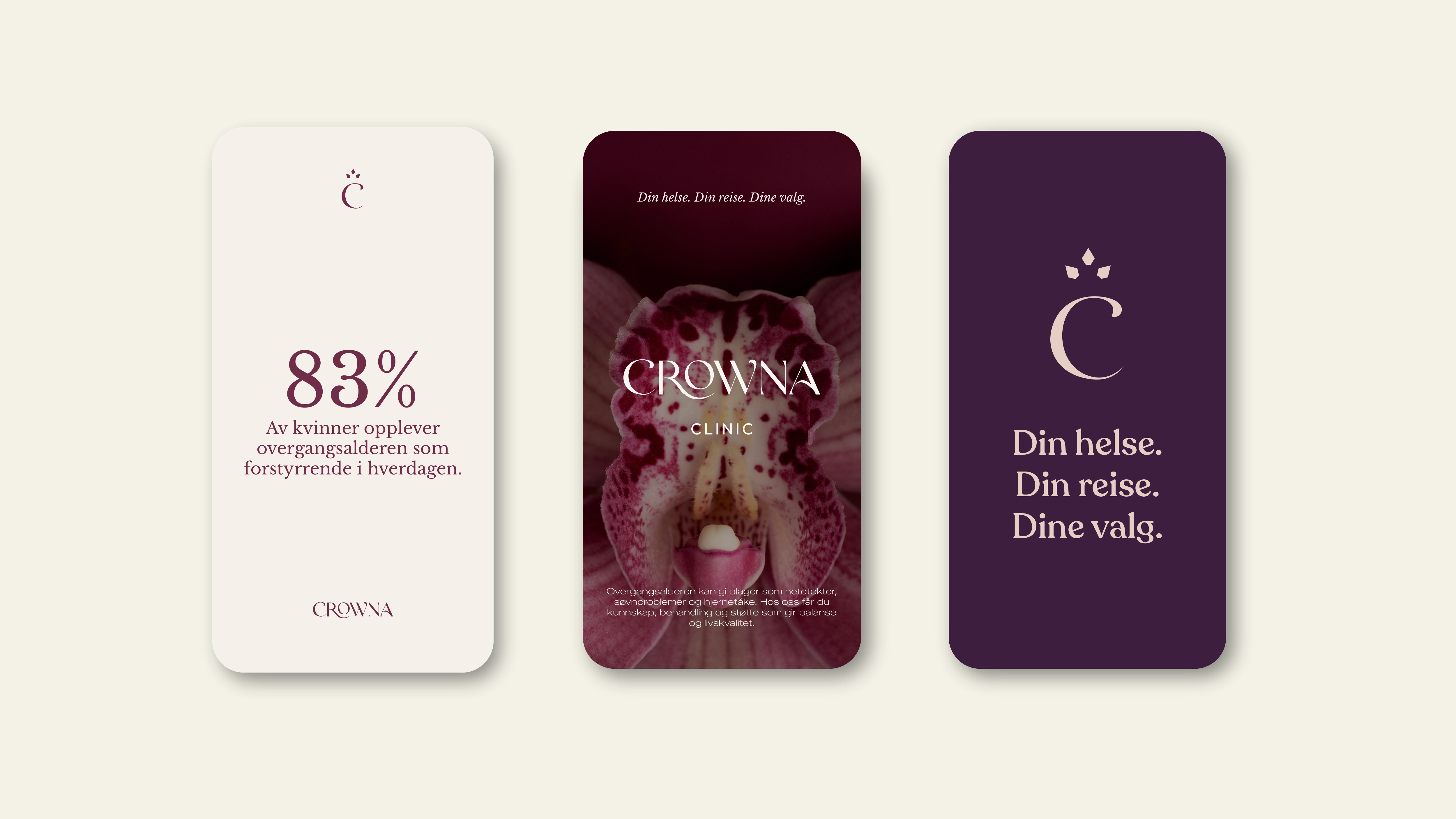
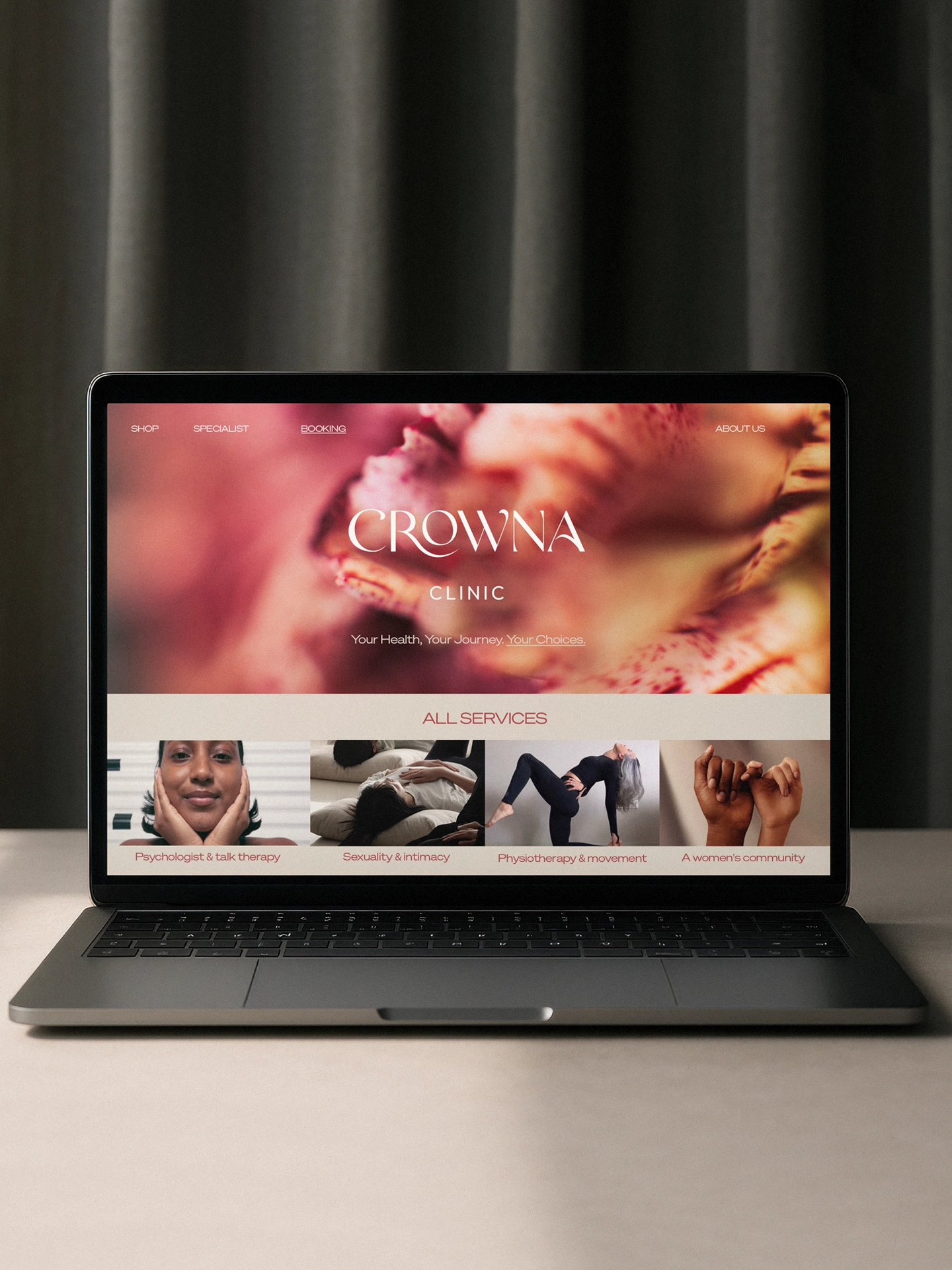
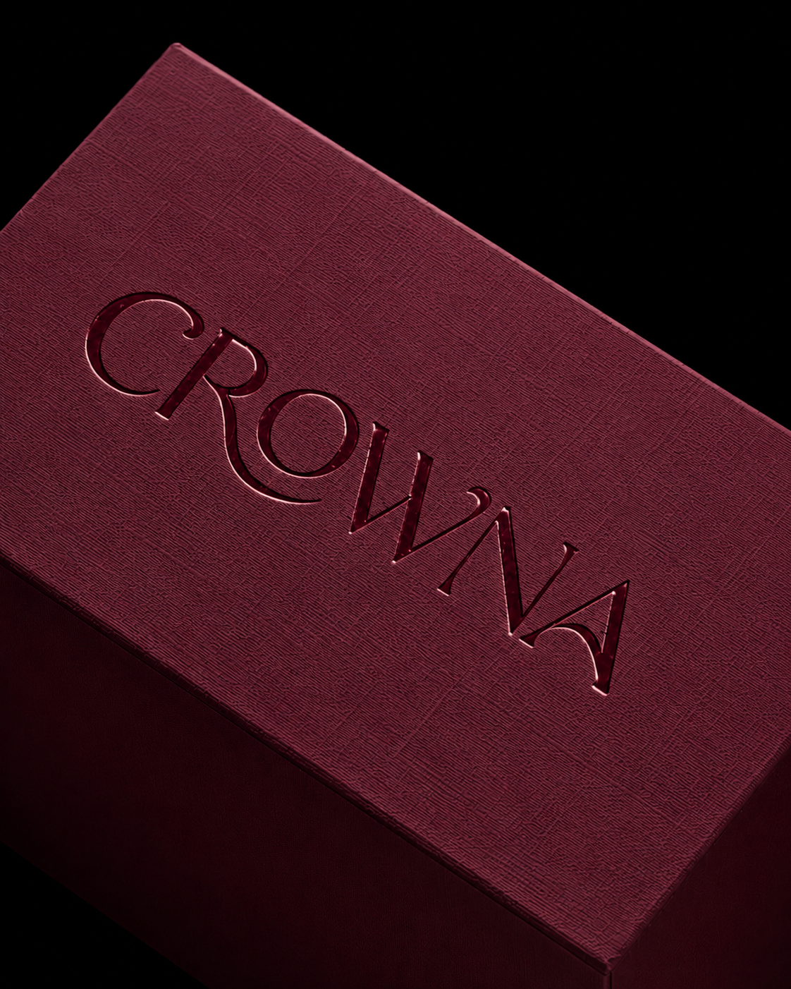
Every visual decision was designed to balance authority and intimacy, creating a clinic language that feels both precise and deeply human.
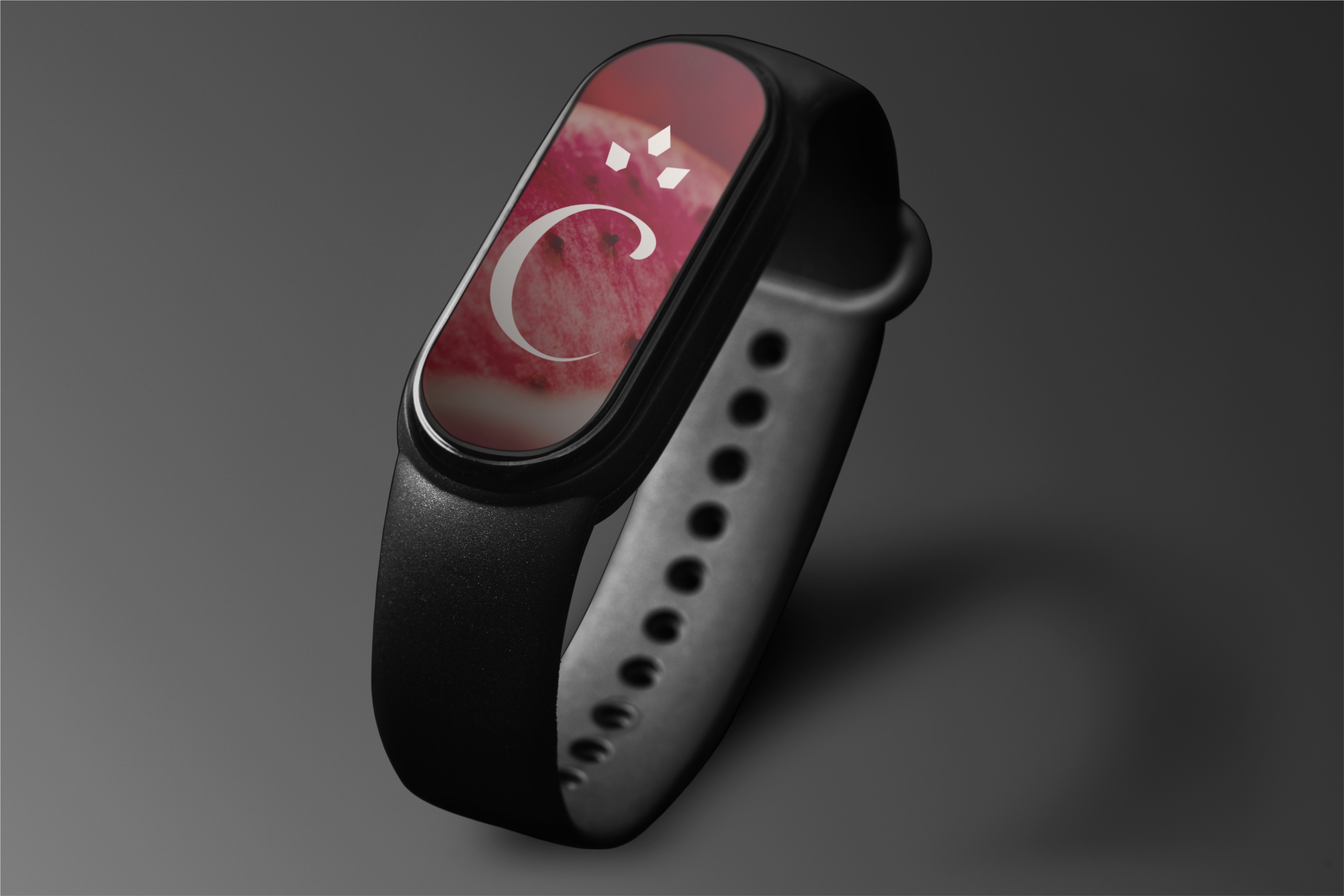
The brand comes to life through a visual language where medical rigor meets softness, movement and emotional clarity.