Hagi
From Craft to Contemporary Indulgence.

Heritage, Made Relevant. HAGI’s multicultural origins were not treated as nostalgia, but as living material for the brand. Ingredients, memories and family stories became a richer narrative territory, connecting heritage with a more contemporary sense of desire.

The wordmark was carefully evolved rather than replaced, refining proportions, rhythm and legibility while preserving the expressive character that made HAGI recognizable.

One System. Three expressions.
The same information hierarchy, different visual languages.
Each line has its own graphic territory, but follows the same structure, ensuring consistency, clarity and ease of scale.
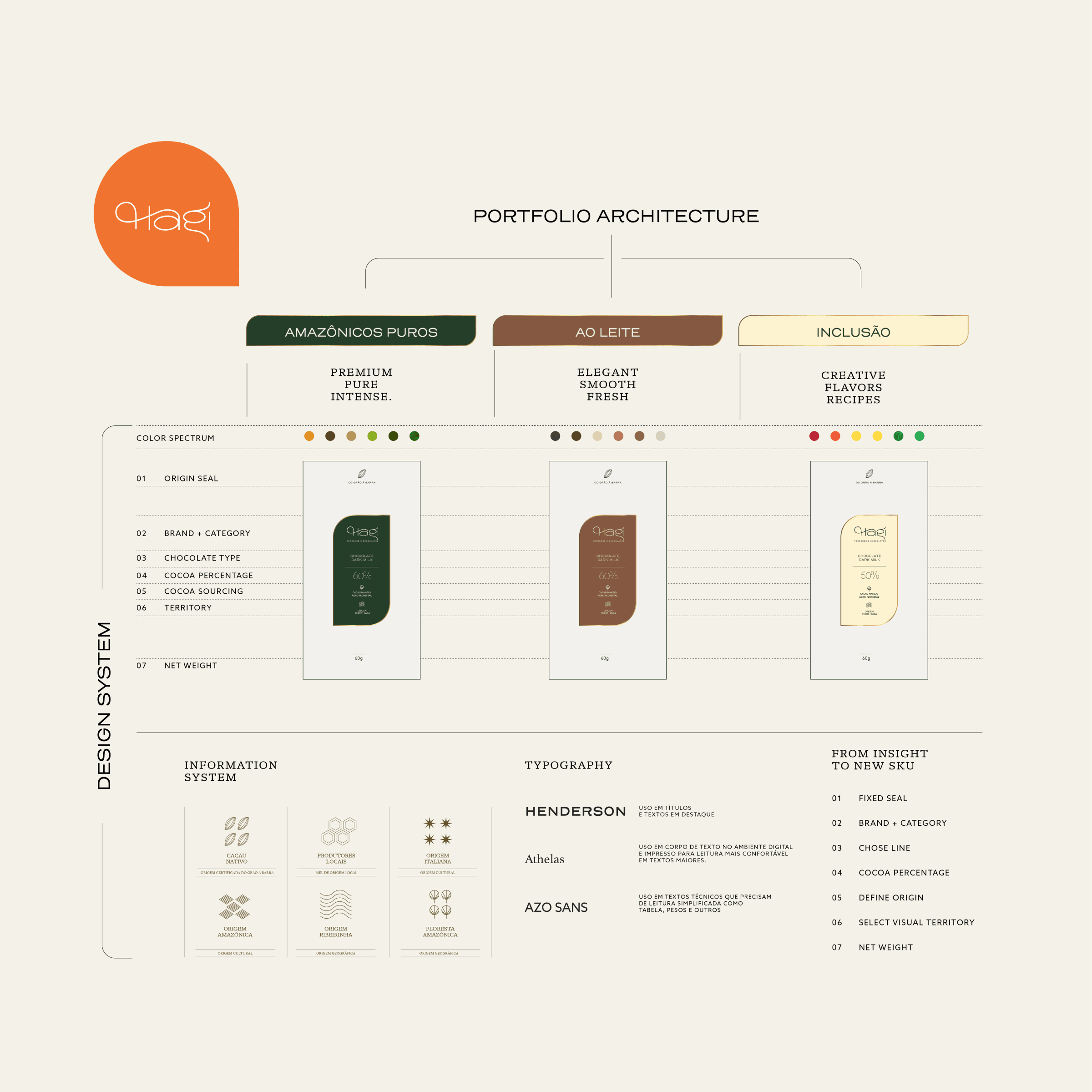

Design to scale
A system built for today and for what comes next. New flavors, new origins, new combinations, all within the same structure.

Making Indulgence Visible.
A new art direction elevated the way products were photographed and presented, bringing texture, richness and appetite into the visual language. The imagery helped shift HAGI from simply showing confectionery to creating a world around the pleasure of it.


Packaging as Part of the Experience.
Rather than starting again, we refined the existing packaging system, adjusting color, hierarchy and visual detail while introducing elements from the new positioning. A clearer, more consistent system gave the brand greater unity across the range, while creating enough flexibility for new products, seasonal launches and special editions.


A Voice with More Flavor. The verbal expression became clearer, warmer and more involving, supporting a brand that could speak with greater confidence to a more sophisticated audience while remaining unmistakably approachable.
