2026 | Creativity powered by co-intelligence
Crowna Clinic
Brand Positioning
Visual Identity
Digital Design
A new chapter in women's health: a clinic fully dedicated to menopause.

01 / 07
Positioning
The identity was shaped before the visual work started: strategy, stakeholders, and what women were missing in menopause care.
Positioning
For CROWNA Clinic, the process began with the belief that a meaningful identity is shaped before the visual work starts. We placed strong emphasis on strategic exploration and a deep understanding of stakeholders and audience: what women were missing in menopause care, how they wanted to feel in a clinical environment, and which emotional, medical and cultural expectations the brand needed to respond to.
Identity
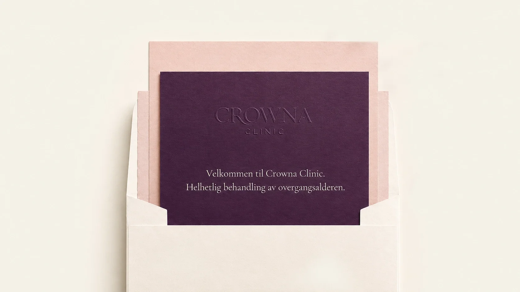
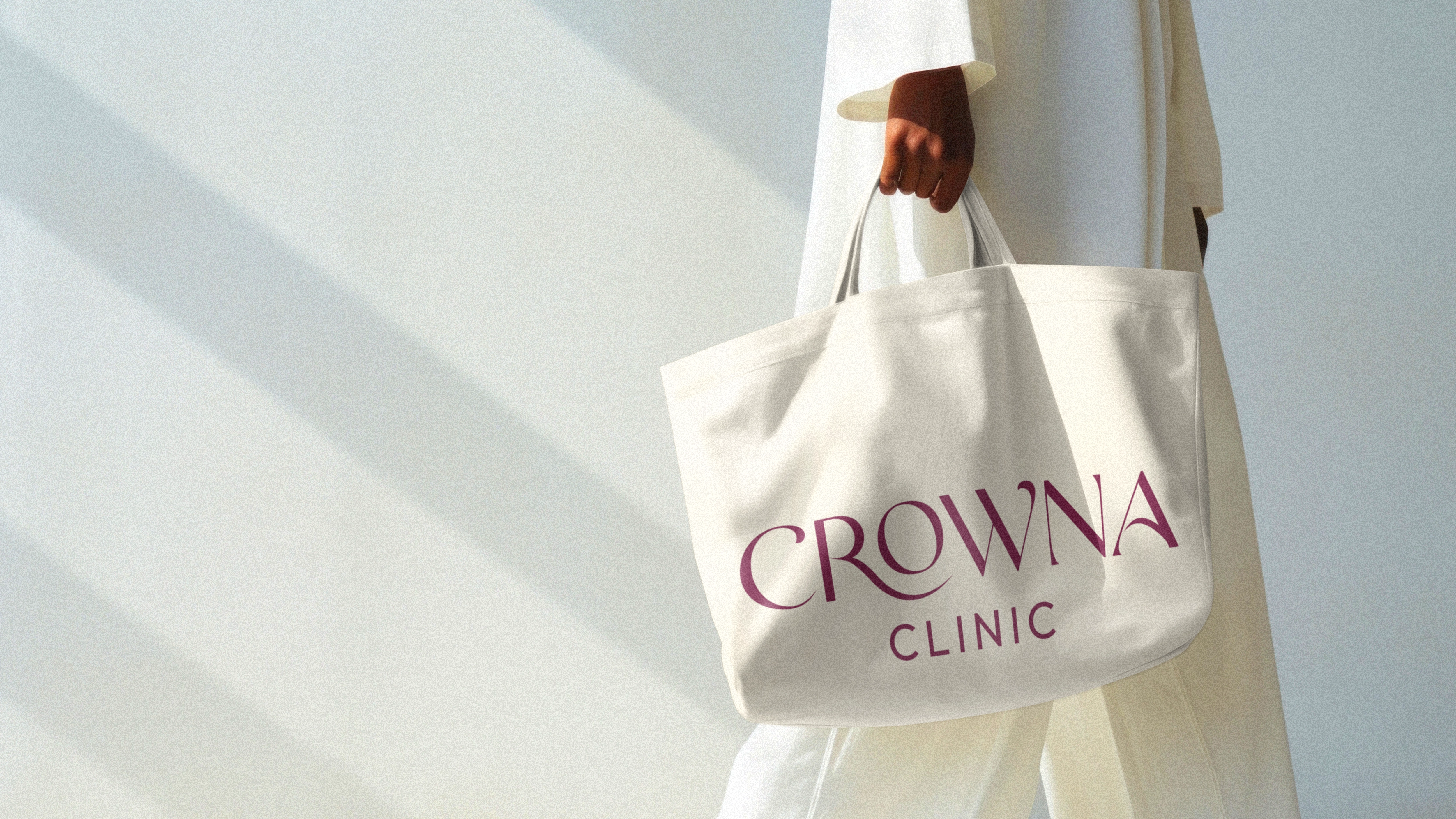
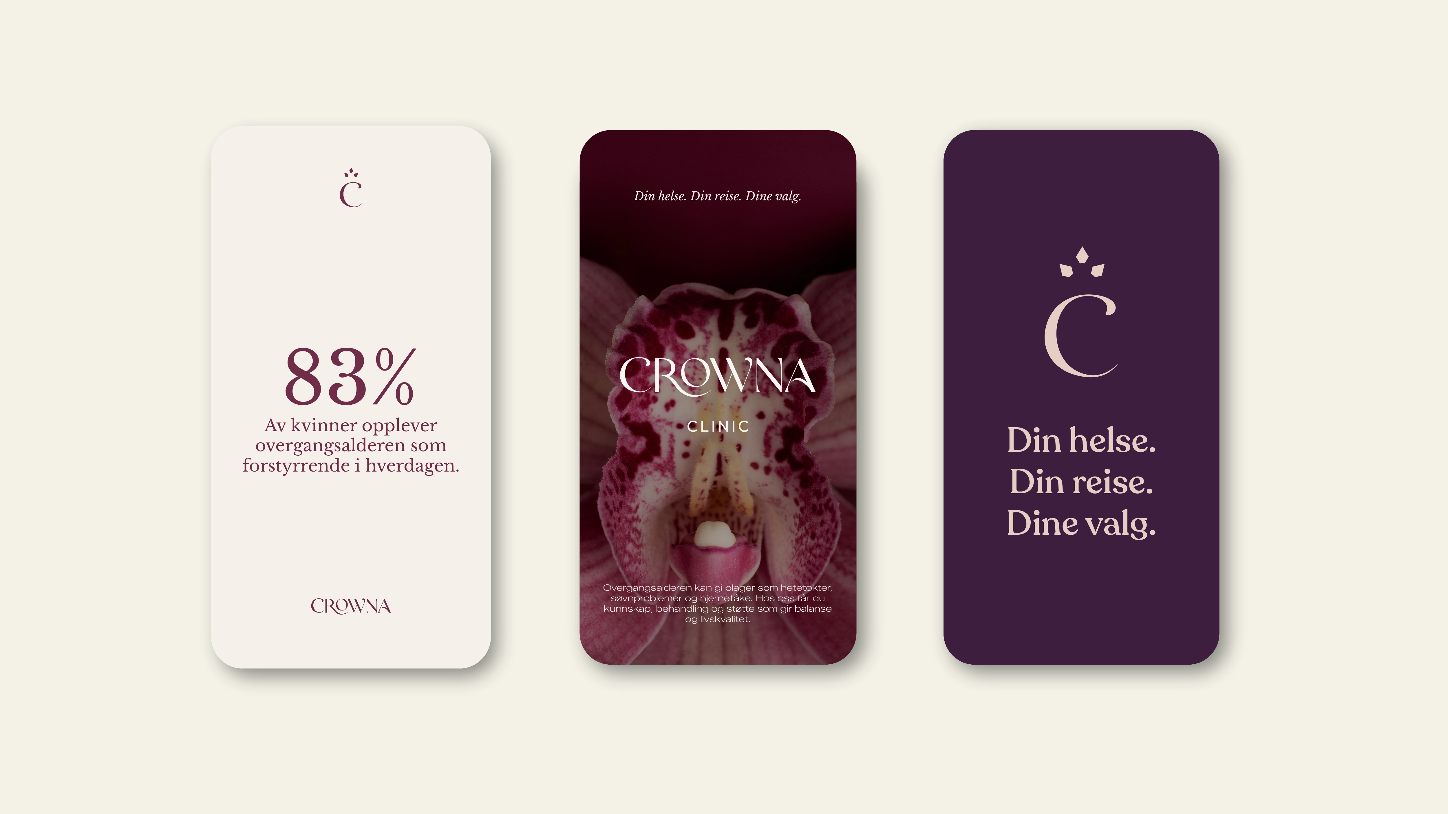
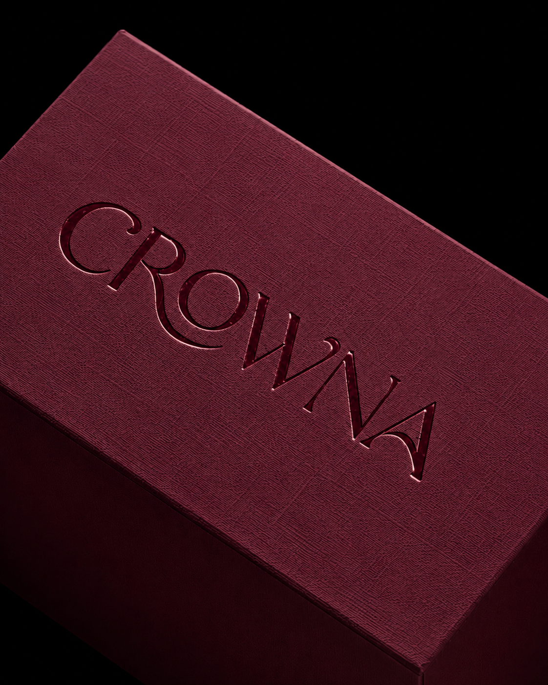
A sculptural serif logotype expresses authority with softness. The custom curves of the wordmark, especially the expressive R, introduce movement, maturity and feminine presence, turning the mark into something alive rather than static.
Digital
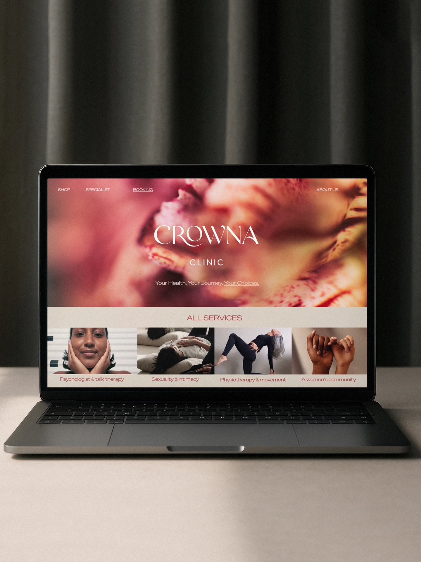
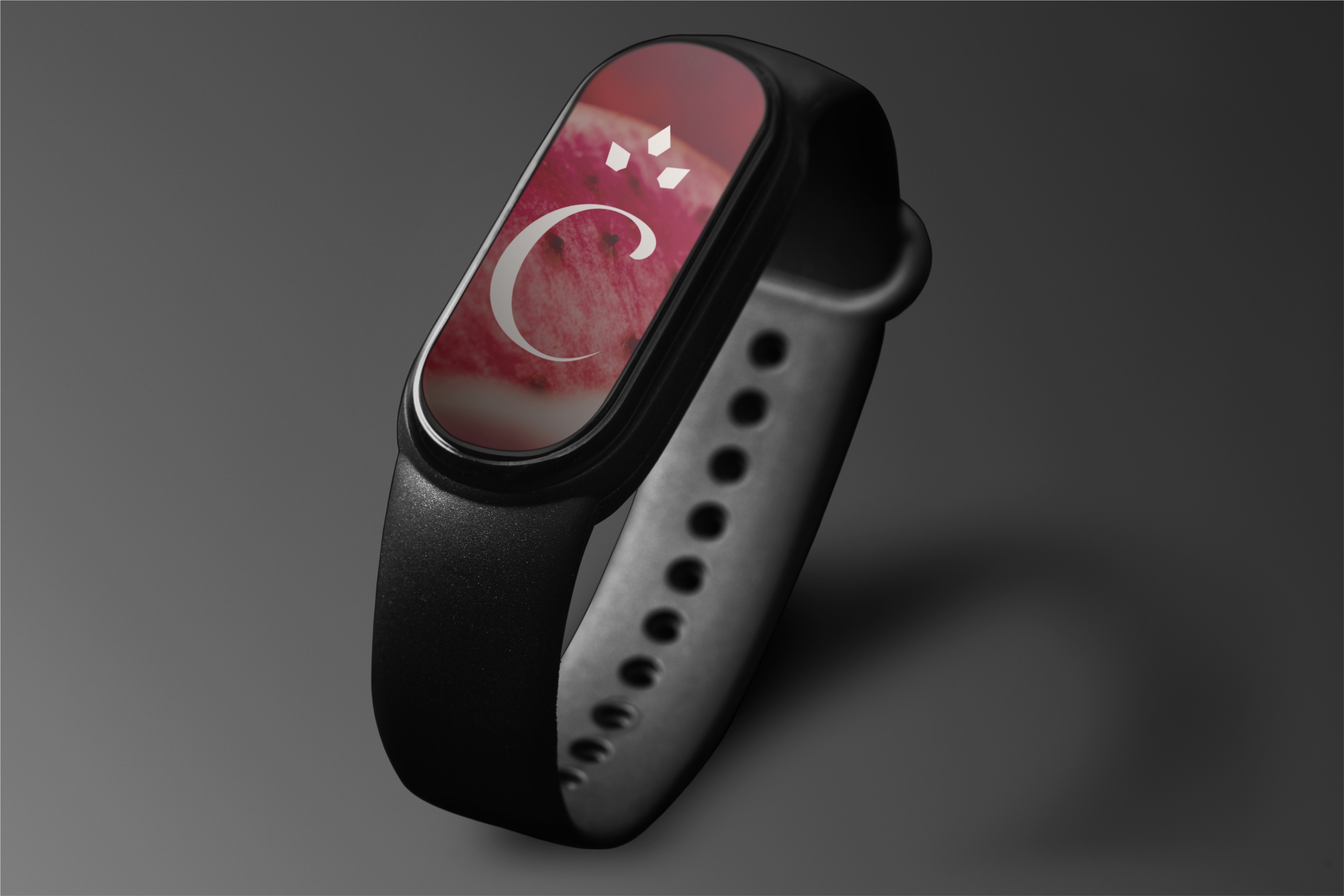
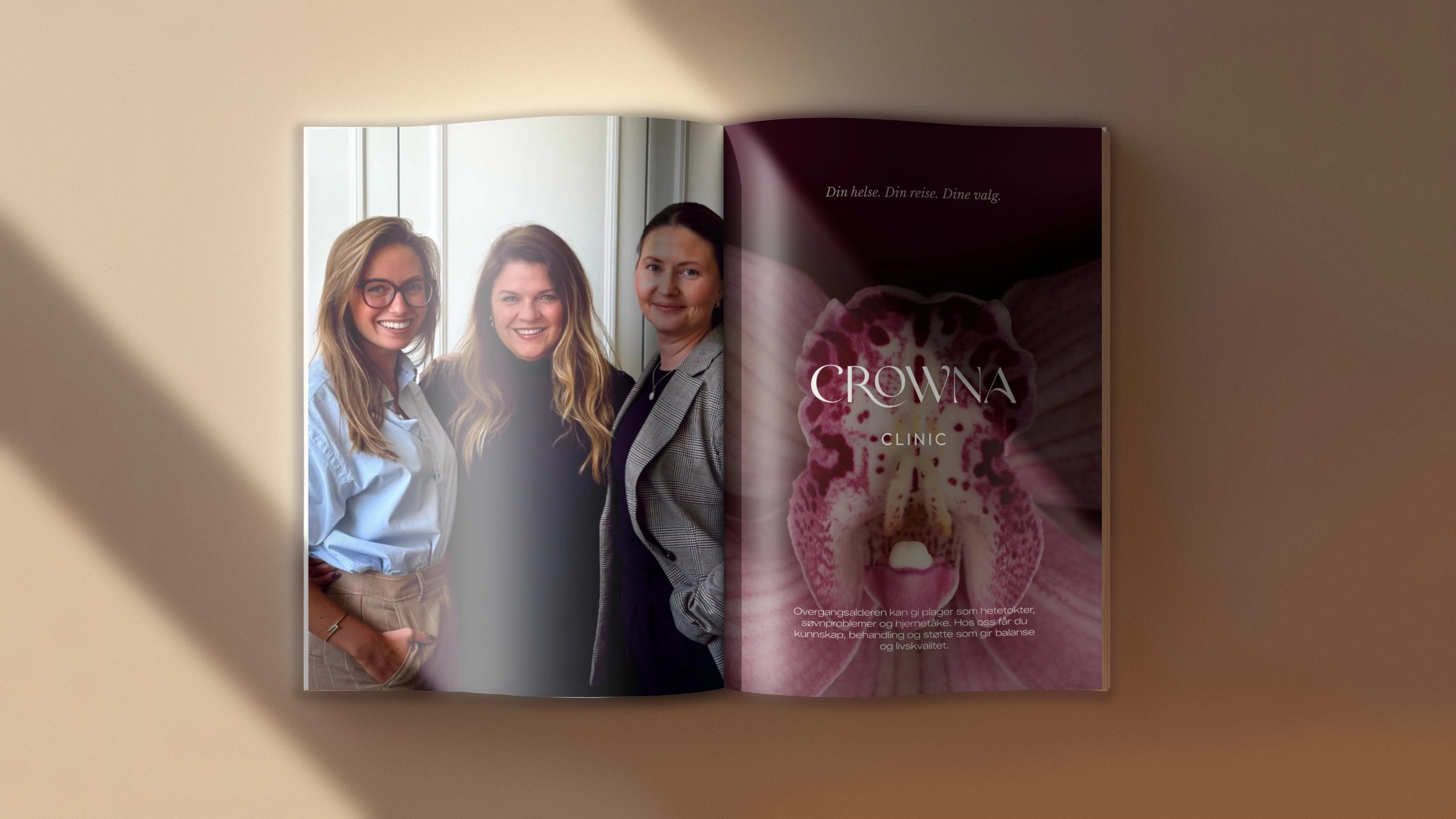
The digital experience carries the same balance: precise, elegant, deeply human. A refined color system and a sensorial brand atmosphere translate clinical credibility into warmth.
Feminine without cliche. Every visual decision balances authority and intimacy, creating a clinic language that feels both precise and deeply human.
Design System
The brand comes to life through a visual language where medical rigor meets softness, movement and emotional clarity.
Methodology™
The Context
Menopause affects most women globally.
Menopause affects most women globally.
The Tension
Care lacked expertise and empathy.
Care lacked expertise and empathy.
Strategic Move
Medical rigor meets lived experience.
Medical rigor meets lived experience.
Design Outcome
Warm proximity with refined sophistication.
Warm proximity with refined sophistication.
The Shift
From clinical coldness to trusted care.
From clinical coldness to trusted care.